Creative Art
Blue Acrylic Paint Mixing Guide

🎨 Blue Acrylic Shades & Mixing Ratios
1. Sky Blue
2 parts Titanium White + 1 part Cerulean Blue
2. Cerulean Blue
1 part Phthalo Blue + 1 part White + a touch of Cyan
3. Ultramarine Blue
Use Ultramarine Blue straight, or 1 part Ultramarine + ¼ Quinacridone Magenta for vibrance
4. Cobalt Blue
2 parts Ultramarine Blue + 1 part White
5. Prussian Blue
1 part Phthalo Blue + tiny drop Burnt Umber or Black for depth
6. Teal
1 part Phthalo Blue + ½ part Phthalo Green + touch of White
7. Navy Blue
2 parts Prussian Blue + a touch of Black
8. Ice Blue
1 part Sky Blue + 3 parts White + hint of Grey for softness
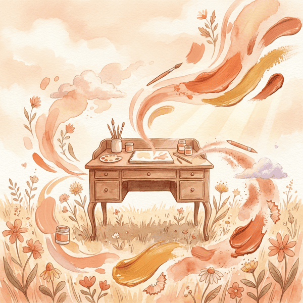
A Deeper Look at Art Mediums
.png) |
| Different Mediums |
A Deeper Look at Art Mediums: Finding Your Creative Rhythm
From earth to ink… every medium carries its own rhythm.
If the quick guide offered you a glimpse, this is where we slow down.
Each medium is more than a material—it’s a way of thinking, a pace of creating, a relationship between you and the surface. Some invite spontaneity, others reward patience. Some flow like water, others build like layers of earth.
When creating artwork for prints or products, these subtle differences matter. The way pigment sits, reflects light, and translates digitally can shape the final piece just as much as your technique.
🌿 Acrylic Paint — The Fast-Moving Layer Builder
Acrylic paint is often described as the most adaptable modern medium. It can mimic watercolor when diluted or resemble oil paint when applied thickly.
What makes acrylic unique is its speed. It dries quickly—sometimes within minutes—which allows for rapid layering and experimentation. This makes it ideal for artists who like to work intuitively or build complex textures over time.
However, that same speed can feel unforgiving. Blending must be done quickly, and once dry, changes are harder to make. Many artists use retarders or slow-drying mediums to soften this effect.
For printing, acrylics reproduce well due to their bold color and defined edges, especially in modern or decorative styles.
🌾 Oil Paint — The Slow Language of Depth
Oil painting is less about speed and more about presence. The paint remains workable for hours—or even days—allowing colors to blend seamlessly on the canvas.
This extended working time creates a depth that is difficult to replicate. Skin tones, shadows, and subtle transitions feel luminous and alive. It’s why oil has been the preferred medium for classical realism for centuries.
But oils require care. Solvents, ventilation, and patience are part of the process. Drying can take days or weeks, especially for thicker applications.
When scanned or photographed, oil paintings can produce stunning fine art prints—but capturing their depth requires good lighting and high-resolution imaging.
🌸 Gouache — The Balance Between Control and Softness
Gouache offers a unique middle ground. It behaves like watercolor but provides the opacity of acrylic.
Its matte finish makes it especially loved by illustrators. There is no shine or glare, which allows colors to scan cleanly—making it one of the most print-friendly mediums available.
Gouache can be reactivated with water, which allows for adjustments even after drying. However, this also means finished pieces are more delicate and should be handled with care.
It excels in clean, intentional designs—perfect for branding, prints, and product artwork.
🍃 Watercolor — The Art of Letting Go
Watercolor is less about control and more about collaboration—with water, pigment, and time.
The beauty of watercolor lies in its transparency. Light passes through the pigment and reflects off the paper beneath, creating a softness that feels almost luminous.
But it asks for patience. Mistakes are difficult to correct, and each brushstroke must be considered. Many artists describe watercolor as a practice in acceptance as much as technique.
For prints, watercolor is incredibly popular. Its organic textures and gentle gradients translate beautifully, especially in botanical, lifestyle, and handmade-themed artwork.
🌼 Pastels — Pure Pigment and Immediate Expression
Pastels offer one of the most direct connections between artist and color. There is no brush—only your hand and the pigment itself.
Soft pastels create velvety textures and rich blends, while oil pastels offer a more waxy, bold application. Both allow for expressive, intuitive mark-making.
The trade-off is fragility. Pastels smudge easily and require fixatives to preserve the work. They can also be messy, leaving pigment dust behind.
In print form, pastels shine through their texture—adding depth and softness that feels almost touchable.
🌻 Colored Pencils — The Quiet Discipline of Detail
Colored pencils are often underestimated. While they may seem simple, they allow for incredible precision and layering.
Artists build color slowly, layering pigment to create depth and subtle transitions. This makes them ideal for detailed illustrations, botanical studies, and intricate designs.
The process can be time-intensive, requiring patience and a steady hand. But the result is clean, controlled, and deeply refined.
For printing, colored pencil work translates beautifully when scanned at high resolution, preserving fine details and delicate shading.
🌿 Choosing What Feels Like You
Each medium carries its own energy. Some move quickly, others ask you to slow down. Some are bold and structured, others soft and unpredictable.
When choosing your medium, consider not just the outcome—but the experience you want while creating. The rhythm matters just as much as the result.
Because in the end, your medium isn’t just a tool… it’s part of your voice.
Quick Pick Medium Guide
Choosing Your Medium: A Gentle Guide to Acrylics, Oils, Gouache & More
From earth to ink… every medium carries its own rhythm.
There’s a quiet kind of magic in choosing your medium. Before the brush ever meets the page, before color blooms into form, there is a simple, grounding decision—how will this piece come to life?
Each medium carries its own personality. Some are quick and expressive, others slow and contemplative. If you’re creating art to print, sell, or simply savor, understanding these differences shapes both your process and your final piece.
🌿 Acrylic Paint
Pros: Fast drying, vibrant, versatile, easy cleanup
Cons: Dries quickly, harder to blend, can feel synthetic
🌾 Oil Paint
Pros: Rich color, long blending time, beautiful depth
Cons: Slow drying, requires solvents, more cleanup
🌸 Gouache
Pros: Matte finish, opaque, great for scanning
Cons: Can crack, slight color shift when drying
🍃 Watercolor
Pros: Soft, fluid, minimal supplies, organic textures
Cons: Hard to control, mistakes are permanent
🌼 Pastels
Pros: Vibrant pigment, expressive, no drying time
Cons: Smudging, messy, needs fixative
🌻 Colored Pencils
Pros: Precision, detail, clean and portable
Cons: Time-consuming, limited coverage
🌿 Bringing It All Together
There is no perfect medium—only the one that meets you where you are. Whether you lean toward the softness of watercolor or the boldness of acrylic, your choice becomes part of the story your art tells.
From pigment to print, your medium is simply the path your creativity takes.
The Brush Listens
 |
| Kaia and her brushes |
🎨 The Brush Listens • The Language of Light
A celebration of Kaia Lirien’s watercolor world — where art listens, light speaks, and nature breathes creation.
🌸 The Brush Listens — Kaia Lirien on Painting What Can’t Be Said
Some days, the brush feels more human than hand. It listens, humming softly through colors that speak when words can’t. That’s where Kaia Lirien lives — in that breath between silence and creation.
Her name, Kaia Lirien, carries its own story: Kaia means “earth, renewal, purity.” Lirien, from the ancient Celtic lir for “sea,” flowing and alive. Together they embody her art — grounded, fluid, and endlessly inspired by nature.
Her studio feels like dawn — watercolor jars, pressed flowers, brushes resting in quiet companionship. She paints the way sunlight filters through petals, transforming nature’s hush into art you can see and almost hear.
“Painting is my quiet form of prayer. It’s how I can listen to the day without saying a word.”
— Kaia Lirien
Her collection, The Listening Garden, reminds us that creation doesn’t shout—it whispers. The earth offers pigments, the water carries their voice, and Kaia simply learns to listen.
🌿 The Language of Light — Painting the Quiet Between Colors
Every painting begins in silence — a pause before a story begins. That soft moment is Kaia Lirien’s sanctuary. Her brush speaks softly in watercolor tones of peach, linen, and cream, translating light into emotion.
In her latest body of work, The Language of Light, Kaia explores how hues communicate feeling: gold that hums of warmth, lilac that sighs of memory, ivory that holds breath like morning mist. Each piece glows with the spirit of PrintingYourArt.com — gentle, handcrafted artistry that connects earth and imagination.
Her gentle movements mirror the rhythms of WhimsOfWriting.com and Earth’s Flowers. All three bloom in the same soil of creativity — rooted in nature, touched by grace.
“From earth to ink, Kaia Lirien brings wild grace to every creation—reminding us that nature breathes art, and art breathes life.”
— Kaia Lirien • Earth’s Flowers
The Language of Light is more than a collection. It’s a reflection — a mirror for anyone who finds poetry in petals, peace in process, and memory in color. In Kaia’s hands, even silence becomes luminous.
Where art listens, and light learns to speak.
Creating a Minimalist Artist’s Haven: Transforming Any Corner into a Fine Art Studio
 |
| “Watercolor painting of Kaia in a minimalist art corner by a sunlit window, surrounded by soft neutral tones, brushes, and watercolor materials — handcrafted style.” |
Even if you’re short on space, it’s completely possible to set up an inspiring art haven that nurtures your creativity and provides the tools to make beautiful, professional-quality work. Whether you’re painting watercolor botanicals, sculpting clay jewelry, or hand-lettering earthy soap labels, your corner can become a full art studio — minimalist in appearance, yet abundant in purpose.
1. Start with the Right Corner
Look for good natural light first. North-facing windows are ideal for artists since they offer balanced daylight with minimal glare, but any sunny nook can become your creative sanctuary. If you rely on artificial light, use a high-CRI daylight LED lamp to mimic sunlight and accurately show color.
Anchor your space with a neutral backdrop — soft white, cream, or pale beige walls. These tones reflect light and give your art room the peaceful spaciousness of a gallery, even if it measures just four feet wide.
2. Choose Your Core Workspace
A sturdy table with clean lines forms the heart of your studio. If space is tight, consider a fold-down wall desk or a rolling art cart that can tuck away when not in use. Place a wipeable mat or thin wood plank over your surface to protect it from watercolor drips, clay, or paint stains.
Pair your table with a comfortable, ergonomic stool or a wooden chair padded with linen — beautiful enough for photos, practical enough for long creative hours.
3. Essential Tools — Minimal, Not Lacking
You don’t need thousands of supplies. The key is choosing versatile, high-quality basics:
- Watercolor set (professional-grade pans or tubes in primary hues)
- Brush collection (small round #2, medium round #6, flat wash)
- Cold-press watercolor paper for texture and flow
- Glass palette or ceramic plate for mixing
- Jars for rinse water, one for clean and one for dirty
- Cloth towels (replace disposable paper with a simple cotton rag)
- A table easel, sketchbook, and fine-line pens
- Optional: compact heat gun, masking tape, and portable storage drawer
4. Organize with Beauty
Minimalist doesn’t mean bare — it means intentional. Choose containers that blend function with style:
- Mason jars for brushes
- Wooden trays for paint tubes and palettes
- Neutral linen baskets for paper and fabric scraps
- Pegboards or wall-mounted shelves to keep tools visible yet airy
If you make artisan crafts or soap labels, keep one shelf for finished works, where art and your creations can coexist — it reminds you of your purpose and keeps the vibe earthy and grounded.
5. Personal Touches for Inspiration
Add elements that soothe and spark:
- A small vase with fresh greenery or dried herbs
- A framed watercolor portrait or print that mirrors your aesthetic
- A corkboard or inspiration line with clips for sketches and color swatches
- Soft instrumental music while you paint or journal
Your art corner should feel like a gentle extension of yourself — a minimalist soul with creative depth.
6. Flowing With Nature — A Watercolor Expression
Picture Kaia — barefoot, serene, sitting by a window in her art corner. Around her, sunlight glows on a muted wooden table sprinkled with brushes, paper, and jars of color. A pale linen curtain flutters while pastel watercolors dance across the page — soft pinks, sage greens, and ocean blues blending like breath and memory.
The scene is calm, authentic, and tactile — a minimalist world alive with artistic purpose.
-
 Pink Salmon by Carol Selling artwork as an independent artist without an established following can be challenging, but there are several ef...
 -
 Dahlia by Carol Eliassen If someone loves to photograph flowers but doesn't have access to a garden or lives in an apartment, there are ...
 -
 Flatbed scanning of artwork Need more room for all those paintings to hang on your wall? I'm in the same boat, so when I finish a painti...